2025 · OLX
From blank form to ready-to-publish, instantly.
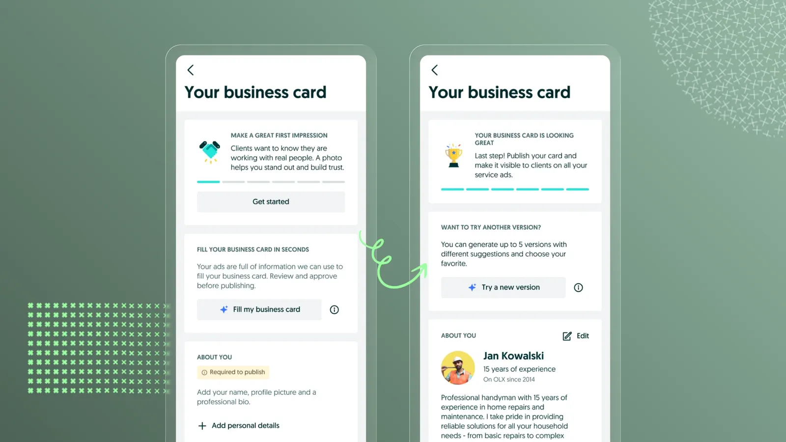
I replaced Business Card's blank form with an AI-ready draft.
Quick overview
- Year
- 2025
- Company
- OLX
- Role
- Product Designer
- Team
- Product Manager, Engineering Manager and engineering team, GenAI team, Legal, the Nexus design-system team, and a Principal Researcher
Business Card, OLX's new profile feature for service providers, had very high early abandonment – most people left before editing a single field. I led the redesign that replaced the blank creation form with an AI-generated, editable draft, validated through moderated usability testing and shaped by close collaboration with GenAI, engineering, and legal teams.
Business Card is a new way for service providers on OLX to present their expertise. The potential value is high, but the feature is still unfamiliar to users. I was the Product Designer behind its redesign, end to end: from diagnosing why so few providers finished creating a card, to an AI-generated draft that replaces the blank form, validated with moderated testing and shaped together with the GenAI, engineering and legal teams.
A note on the numbers. Figures marked like [X]% are placeholders. The real values are confidential, so I’ve left them out.
Context
Business Card
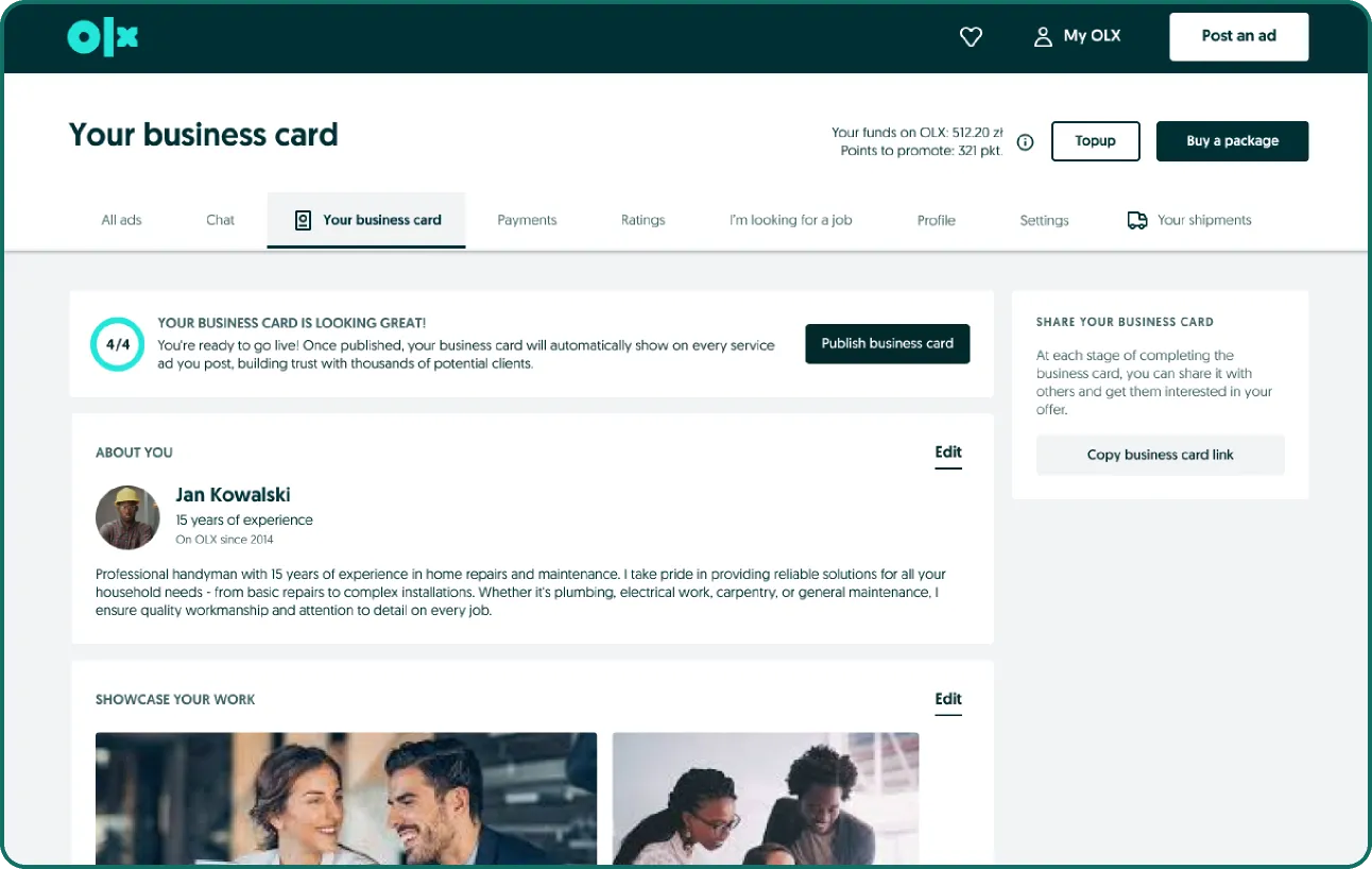
Business Card lets a service provider present themselves on OLX with a profile clients can trust and share.
Where Business Card fits today
- Built by the Services team on a foundation similar to Jobs’ Company Profile, so it’s still limited in flexibility and features.
- Available only in some Services categories: Construction & Renovation, Cleaning and Gardening.
- Today the card holds an “About you” section (picture, experience, bio), a photo gallery of the provider’s work, contact details (phone, email, social media), and ratings & reviews.
Why it matters long-term
Business Card is set to become a key identity layer across Services: it will be visible on listings and will power the Request Platform, where seekers post requests instead of providers posting offers. The opportunity is clear: a strong Business Card means higher trust, easier matching and a stronger provider identity.
Discovery
The problem: a very high early drop-off
Business Card showed very high early abandonment:
| Metric | Value |
|---|---|
| Providers who publish their Business Card | ~[Z]% |
| Users who leave before editing any field | [Y]% |
| Drop-off in the creation flow | [X]% |
Three things made this close to inevitable: the flow felt too effort-heavy at the very beginning, users struggled to understand the value of a Business Card, and the time and effort simply weren’t justified for most providers.
How might we reduce the initial effort required to create a Business Card so that more providers complete the flow?
Goal and data insights
The goal of discovery was to understand why providers abandon the flow and to identify the real barriers behind low completion. The product data said three things:
- Very low publish success. Many providers enter the flow, but few reach the finish line.
- Low editing activity. Most users perform minimal actions inside the flow before abandoning it.
- Publishing errors. A significant share of users hit errors when publishing, so technical friction lowers publish success further.
User survey
I asked providers what was the most challenging part of setting up their Business Card.
| Answer | Share of respondents |
|---|---|
| Nothing was challenging | 62.5% |
| Writing the bio/description | 10.6% |
| Uploading and formatting the profile picture | 10.2% |
| Choosing which services to list | 5.8% |
| Organizing contact information | 4.6% |
| Other | 3.7% |
The most common answer by far was “nothing was challenging”, which was itself the finding: most people weren’t stuck on a specific step, they were leaving before they engaged with one.
Benchmarks
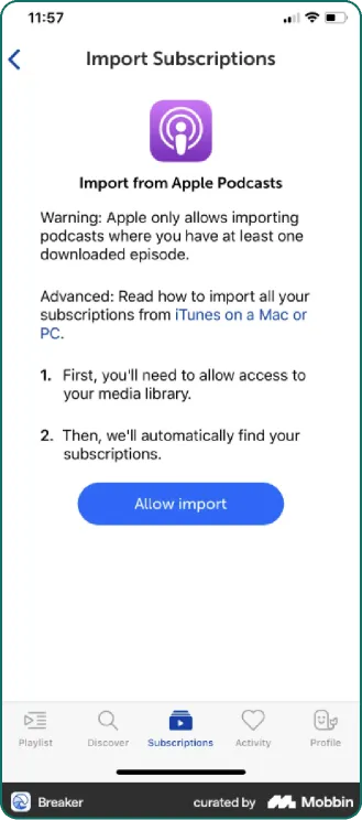
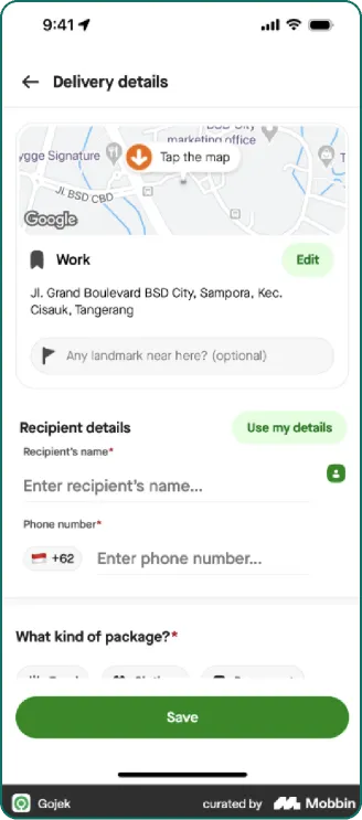
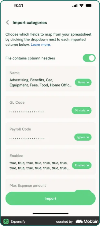
External (via Mobbin). I analysed flows where products reduce setup effort: auto-prefill from existing data, “use my details” and reusing profile information, automatic draft creation, importing data from linked apps or services, and guided “review & confirm” onboarding. The insight: these flows minimise manual input by starting from something, not from scratch.
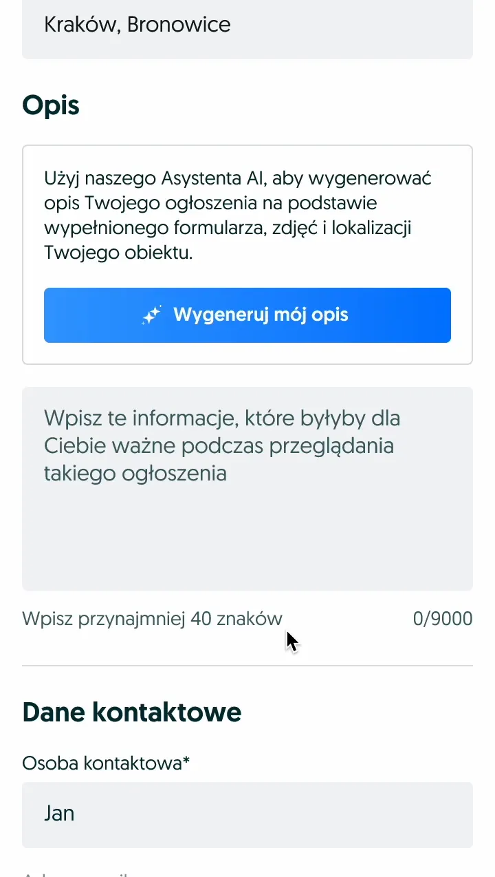
Internal. I looked at GenAI descriptions in Otodom, visual-based prefill in OLX ad posting, and the GenAI description experiment on iOS I’d run on a previous project. The insight: editable AI suggestions reduce friction and improve completion, even when the content isn’t perfect.
Hypothesis
Auto-filling the Business Card using providers’ existing data will allow us to replace a complex, low-value task with an immediate, ready-to-publish experience, unlocking higher adoption and drastically reducing early drop-offs.
Design
Brainstorming
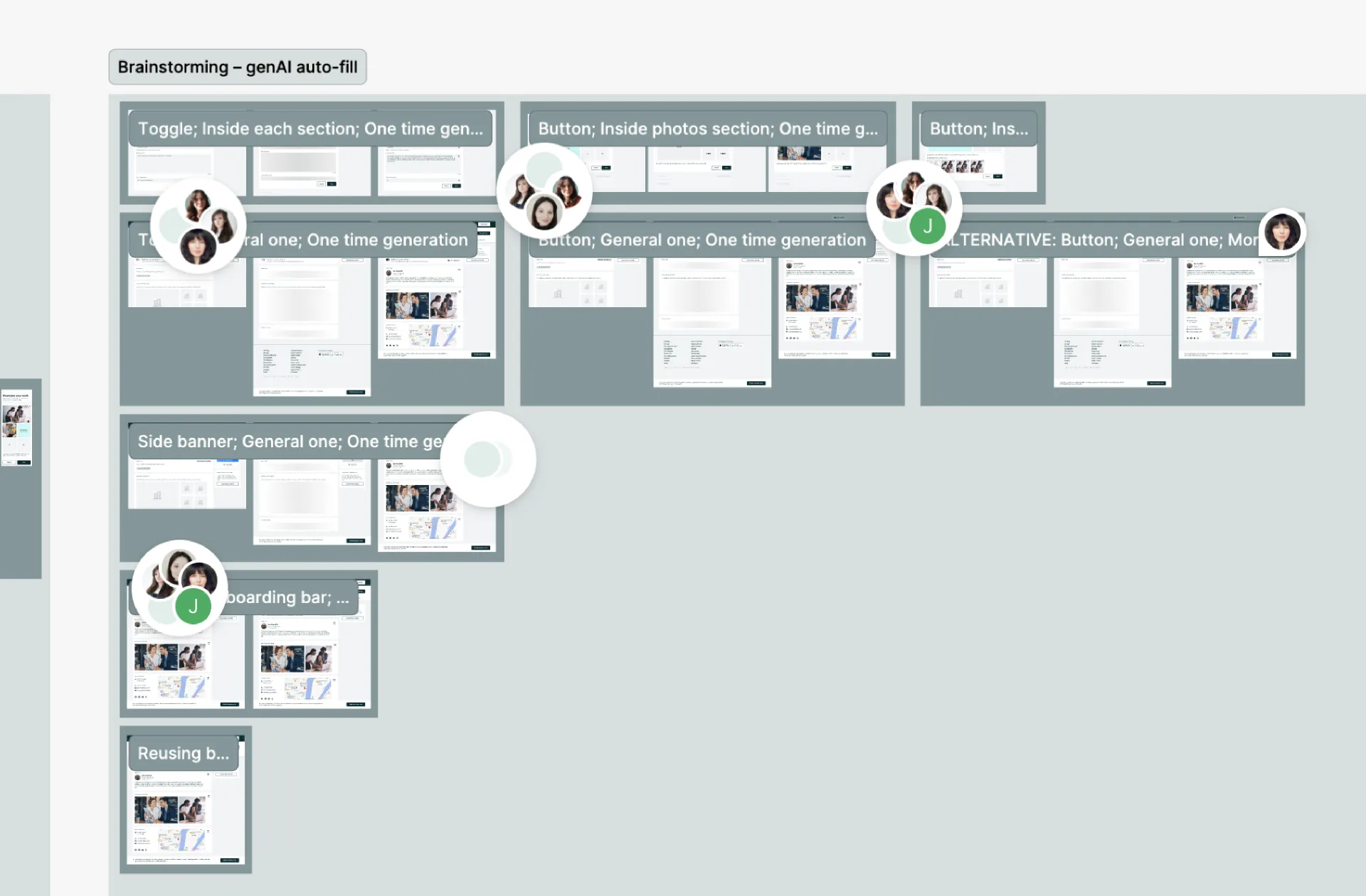
I ran brainstorming that produced a wide set of early concepts for how autofill could work inside the creation flow.
From exploration to two directions
I consolidated the early concepts, then filtered them with the PM, the EM and fellow designers. Anything with trust issues or technical risk was removed, and what remained was prioritised for value, clarity and feasibility. That narrowed the exploration to two directions:
- A. User-triggered autofill. The provider asks for a draft.
- B. Auto-generated draft on entry. A draft is already there when the provider arrives.


Both variants are blurred for confidentiality.
Stakeholder alignment
I presented both options to the product team (PM, EM and engineering), the GenAI team, the Legal team, and the Nexus designers, to keep it consistent with emerging GenAI patterns. We aligned that both variants solve the problem in different ways, both are feasible within our constraints, and both provide value and deserve validation.
The decision: take both versions, A and B, into moderated user testing. That gave us evidence to choose the direction with the highest user value.
User validation
Research plan
The goal was to evaluate the usability and perceived value of GenAI-assisted Business Cards, and to uncover providers’ expectations, concerns and openness toward GenAI. The method was a moderated usability test of two variants, manual versus auto-prefill, with services users who didn’t have a Business Card yet.
The initial plan was six participants, three on mobile and three on desktop. After consulting the draft scenario with our Principal Researcher, we changed it to eight: two per variant, on mobile and on desktop.
A small pivot, then a bigger one
We couldn’t secure desktop participants, and recruitment became a blocker. To avoid delaying the initiative, I narrowed the study to four mobile users, two for Variant A and two for Variant B.
What I observed
This is great – I don’t have to think. I enter and it’s basically done. I would definitely publish it like this.
– Respondent 1, Variant B (auto-prefill)
It’s fine if AI writes it, as long as I can change what I don’t like. Machines make mistakes, but I can fix them.
– Respondent 2 (editing builds trust)
Show me a few versions so I can pick the best one. One description is not enough – I want to choose, not just accept.
– Respondent 3 (desire for control and variations)
Key findings
- Auto-prefill meaningfully reduces effort. Users appreciated starting from a ready-made draft, describing it as “already done” and much easier than a blank form.
- AI content is acceptable as long as editing is easy. Participants trusted the output when they knew they could quickly tweak it to match their voice.
- Users expect control over specific sections. They wanted to regenerate only the part they were looking at (description, services, captions), not the whole card.
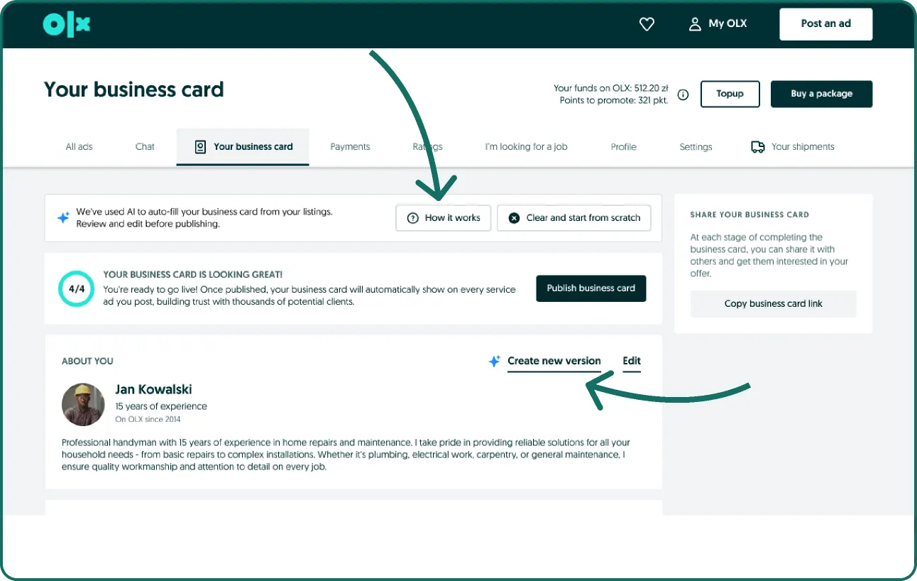
- Transparency needs to be more noticeable. The banner was easy to miss; users want a clear but concise sign of what was AI-generated and why.
- The card is worth more when users know where it appears. Once we clarified that it shows on all their listings, participants saw more purpose and were more willing to publish.
- The layout could feel more “business card-like”. Users expected a more compact, visual summary, especially on mobile.
Participants leaned toward Variant B, mainly because it required fewer actions and felt “closer to publishing”.
How the insights shaped the design
| User insight | Design response |
|---|---|
| Auto-prefill gives instant value, reduces effort | Variant B became the primary direction |
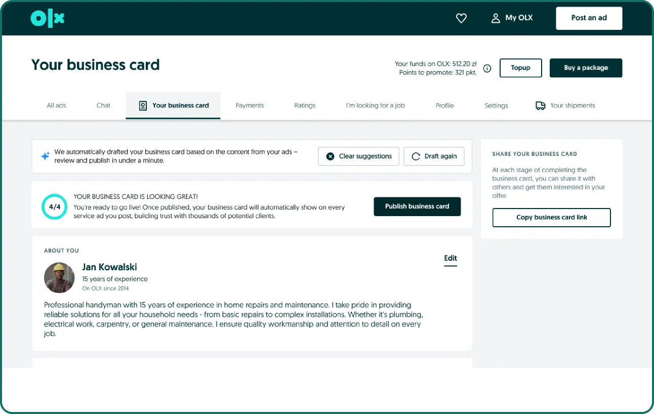
| Users need granular control over AI output | Added section-level regenerate, removed the global one |
| The AI banner sometimes goes unnoticed | Changed the copy and added a “How it works” link |
| Fear of losing work when regenerating | Added a per-section undo/restore |
Long-term opportunities
These came out of the research as clearly wanted, but they were out of scope for this iteration:
- Multiple AI suggestions at once. “Show me 2–3 options so I can choose” was requested often.
- Better support for multi-service providers. Combining unrelated specialisations (for example tutoring and gardening) was confusing.
- A more “card-like” layout. Something more visual, condensed and scannable, closer to an actual business card.
- Optional AI captions for photos to complement the gallery.
- Tone and length adjustments, such as “shorter”, “more formal” or “simpler”.
Delivery
Cross-functional alignment
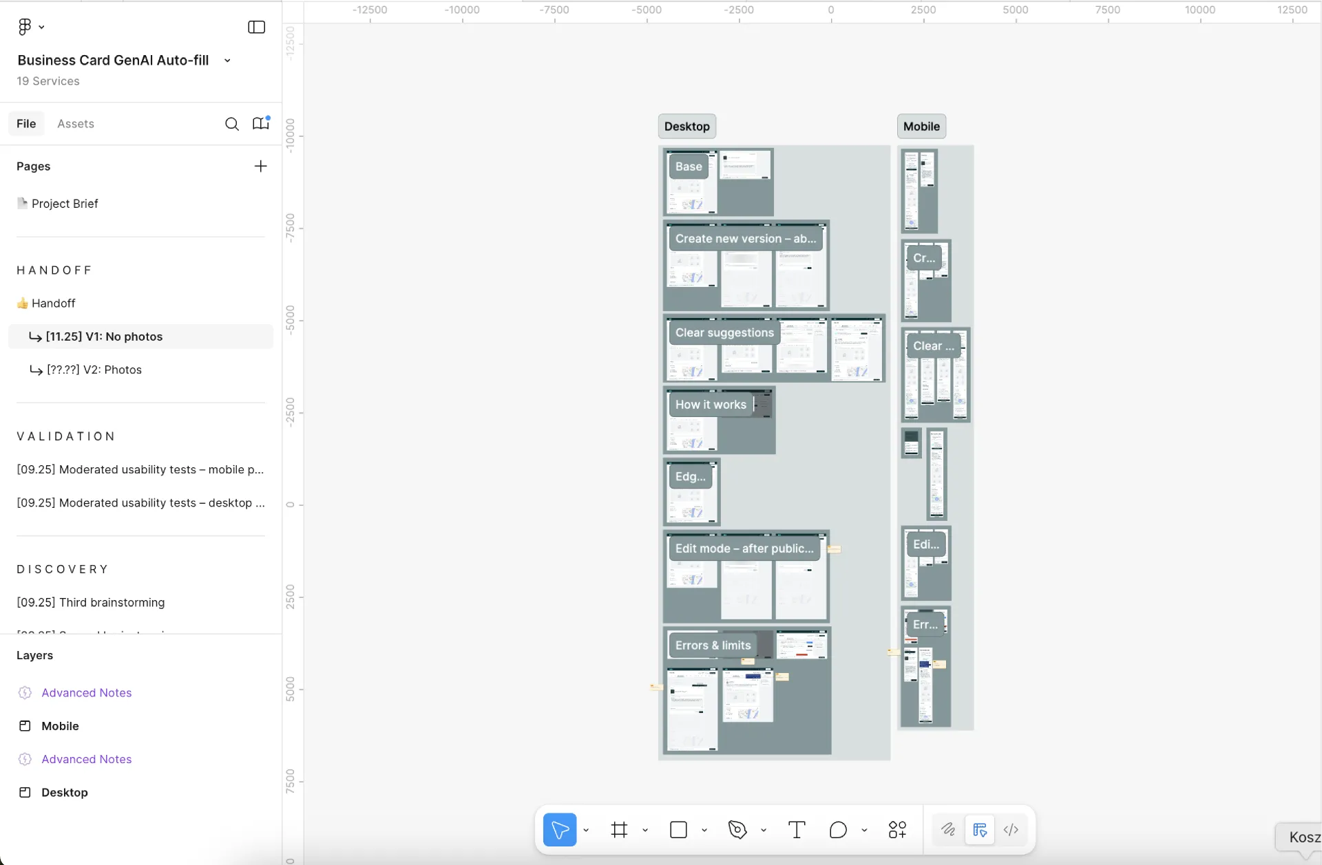
Delivery meant staying aligned with more than engineering: feasibility with engineering (what’s in the MVP and what moves out), a full handoff of flows, specs and tracking, and alignment with the GenAI team on model behaviour, constraints and strategy.
Key risks and mitigations
| Risk | Mitigation |
|---|---|
| Low perceived value. Even if creation is easier, some providers may not see enough value. | Clarify where the card appears, improve the summary view, and monitor post-publish engagement and feedback. |
| AI output quality varies. Some content may feel off or need more editing. | Section-level regenerate, clear editability, and a transparent “How it works”. |
| Low-data users. Providers with few or weak listings may get poor suggestions. | Background pre-generation detects low-data cases early; if generation still fails, we show a clear message and let the user continue manually. |
| Performance and system issues. Generation can fail or be slow. | Background pre-generation, error monitoring and clear failure states. |
Two decisions that shaped delivery
The first was to pre-generate the AI content in the background, not on entry. The second was to ship text-only autofill in the first iteration.
| Generate on entry | Pre-generate in background | |
|---|---|---|
| User experience | ~10 second wait | Instant draft |
| Reliability | More failures (low-data users) | Fewer edge cases |
| Cost | Lower | Higher |
| Decision | Not chosen | Chosen |
Pre-generating cost more to run, but it gave providers an instant draft and left fewer edge cases. Scoping the first iteration to text only let us ship, learn and test real value before expanding to photos and other elements.
The experiment
Setup
We released the change as an A/B test. The control was an empty Business Card where only manual input was possible; the variant was the AI-prefilled draft. The goal was to validate that autofill improves completion before rolling it out broadly. The rollout was phased: desktop and mobile web first, then Android and iOS once we had initial learnings.
What we measured
Success meant more providers publishing Business Cards, with less effort and richer profiles.
- Primary metric: publish conversion (view to publish), with a target of at least [C]%.
- Secondary metrics: user satisfaction with autofill (survey and feedback), Business Card engagement (views and clicks), profile completeness, and edit and regenerate behaviour.
Results
The AI autofill variant achieved a higher publish conversion than the control, the empty Business Card. The exact values are withheld for confidentiality.
Adoption
- Autofill handled its first publishes right away, in the first days of the rollout.
- Use was stable, with autofill used every day of the test.
- People look at how it works. Providers open the “How it works” info link, so the transparency around AI is being noticed.
Trust and control
- Safeguards catch the edge cases. Limits, validation and missing-data checks recognise the cases where a good draft can’t be made.
- Providers can always finish by hand, so autofill never blocks publishing.
- We know what to optimise. The backend classifies the causes of problems, so we can see where to improve first.
Next steps
With a positive result, the focus moves from validating to scaling:
- Roll out to Android and iOS (phase 2).
- Refine the messages shown to low-data users.
- Choose the right limit for how many times a provider can generate.
Summary and reflections
What I learned
- Share early, especially with GenAI teams. Early alignment avoids rework when model capabilities or constraints change.
- User clarity beats feature complexity. Even strong AI needs clear framing, transparency and user control to be trusted.
- Scope with impact in mind. Text-only autofill let us move fast, test real value and avoid over-engineering.
- Research plans must stay flexible. We adapted the sample size and method to constraints without compromising the quality of the insight.
- People actually use GenAI tools, regardless of their age or profession.
What I would do differently next time
- Validate value perception earlier. We confirmed usability, but I’d also run a quick early probe on the perceived value of Business Cards themselves.
- Plan for research recruitment risks. Next time I’d secure fallback options earlier: a backup vendor, broader criteria, or async testing.
- Push for tighter cross-team alignment earlier. Earlier syncs between engineering and the GenAI team could have avoided some small pivots later.